
D&AD Pro Awards Entry Site Redesign
D&AD Pro Awards Entry Site Redesign
In this project, I led the UX redesign of the D&AD Pro Awards Entry Site. My primary focus was on creating a seamless, user-centered experience that would streamline the awards submission process for creative professionals across the globe. By combining in-depth user research, iterative testing, and strategic collaboration with the design and development teams, I transformed the platform’s workflows to meet both user needs and business objectives.
In this project, I led the UX redesign of the D&AD Pro Awards Entry Site. My primary focus was on creating a seamless, user-centered experience that would streamline the awards submission process for creative professionals across the globe. By combining in-depth user research, iterative testing, and strategic collaboration with the design and development teams, I transformed the platform’s workflows to meet both user needs and business objectives.

Project Overview
The D&AD Pro Awards Entry Site is a vital portal for creatives and agencies worldwide, but user feedback indicated the need for modernization and a more intuitive interface. I set out to streamline the submission journey and refine the platform’s functionality, ensuring it could efficiently handle all types of users—from a creative freelancer entering one category to large agencies submitting over 100 entries each year. By leveraging user-centric research methods and iterative design improvements, my goal was to eliminate friction, optimize workflows, and deliver a seamless experience aligned with both user and business objectives.
Challenges
The biggest challenge was simplifying the submission process while accommodating hundreds of categories and subcategories, each with different application requirements. Despite this complexity, the platform needed to feel consistent and intuitive for all users.
What started as a two-month project evolved into a four-year iterative process as we uncovered the full complexity of the system. The Entry Site also had to seamlessly integrate with D&AD’s internal Logging System, ensuring that behind-the-scenes processes didn’t disrupt the user journey.
Objectives
Streamline the submission process to make it faster and more intuitive.
Ensure a seamless experience for both freelancers submitting one entry and agencies managing over 100 applications.
Improve overall platform functionality while maintaining consistency across different award categories.
Facilitate integration with the internal Logging System without introducing complexity for users.
By focusing on user research, usability testing, and scalable design, I worked to create a submission platform that is both efficient and adaptable.

To create a more intuitive and efficient submission experience, I conducted extensive user research to understand the needs, frustrations, and behaviors of entrants using the D&AD Pro Awards Entry Site.
I conducted:
User interviews with freelancers, agencies, and returning applicants.
Surveys to gather insights on common frustrations and feature requests.
Competitor analysis & heuristic evaluation to identify industry best practices.

Through this research, I developed user personas and mapped user journeys to highlight key pain points.
Some of the main findings included:
Category selection was overwhelming due to the number of options and lack of contextual guidance.
The submission process was complex and repetitive, requiring users to re-enter the same project details multiple times.
Pricing was a barrier for small entrants.
Pricing transparency needed improvement.
File submission specs lacked clarity, adding unnecessary friction to the process.
The payment model lacked flexibility, who often needed more time to finalize entries.
D&AD needed to encourage early submissions, as logging entries early made internal processes more manageable.
Adding credits was a time-consuming task, as users had to enter names manually, one by one.

These insights laid the foundation for the redesign, ensuring that every design decision moving forward was user-driven and strategically aligned with business goals.
These insights laid the foundation for the redesign, ensuring that every design decision moving forward was user-driven and strategically aligned with business goals.

PHASE 1: Discover
PHASE 2: Discover
With key insights from the Discover phase, I transitioned into Phase 2 defining the structure and core functionality of the new platform. This phase focused on creating a clearer, more efficient submission experience by addressing the identified pain points.
To establish a strong foundation, I worked on:
MVP definition, prioritizing essential features to improve the submission flow.
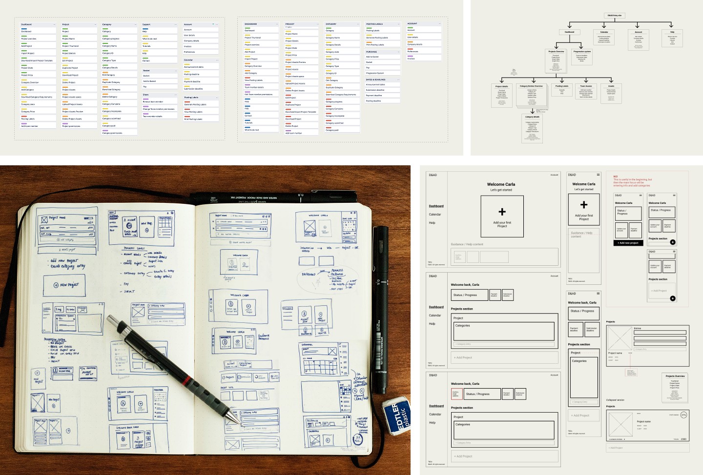
Card sorting exercises, helping to create a logical and intuitive information architecture for the platform and main navigation
Information architecture & site mapping, ensuring structured navigation and content organization.
Early sketching & wireframing, exploring ways to simplify the entry process while maintaining flexibility for different user needs.
With key insights from the Discover phase, I transitioned into Phase 2 defining the structure and core functionality of the new platform. This phase focused on creating a clearer, more efficient submission experience by addressing the identified pain points.
To establish a strong foundation, I worked on:
MVP definition, prioritizing essential features to improve the submission flow.
Card sorting exercises, helping to create a logical and intuitive information architecture for the platform and main navigation
Information architecture & site mapping, ensuring structured navigation and content organization.
Early sketching & wireframing, exploring ways to simplify the entry process while maintaining flexibility for different user needs.
Key strategic improvements included:
Making category selection more intuitive by providing better guidance and contextual information, helping users quickly identify the most relevant categories.
Improving pricing transparency by displaying the total cost of all created entries upfront, allowing agencies and individuals to better estimate budgets before payment.
Introducing discount codes for freelancers and small agencies to remove pricing barriers and encourage wider participation.
Reducing repetition in the submission process by allowing users to reuse project details across multiple categories.
Clarifying file submission specs to remove uncertainty and eliminate unnecessary delays.
Offering greater payment flexibility by allowing entrants to pay first and submit later, ensuring they could finalize entries within their internal approval timelines.
Encouraging early submissions through a tiered pricing model, balancing the needs of entrants with D&AD’s internal requirement to log entries progressively.
Improving the credit submission experience by making it faster and less repetitive, reducing frustration during this crucial step.

This phase set the groundwork for a more intuitive, scalable, and user-friendly entry platform, ensuring consistency across all award categories while accommodating different user needs.
This phase set the groundwork for a more intuitive, scalable, and user-friendly entry platform, ensuring consistency across all award categories while accommodating different user needs.

PHASE 3: Ideate and Design
With a solid framework in place, I moved into Phase 3: Ideate & Design, where I translated research and strategy into interactive, user-tested prototypes.
Key activities included:
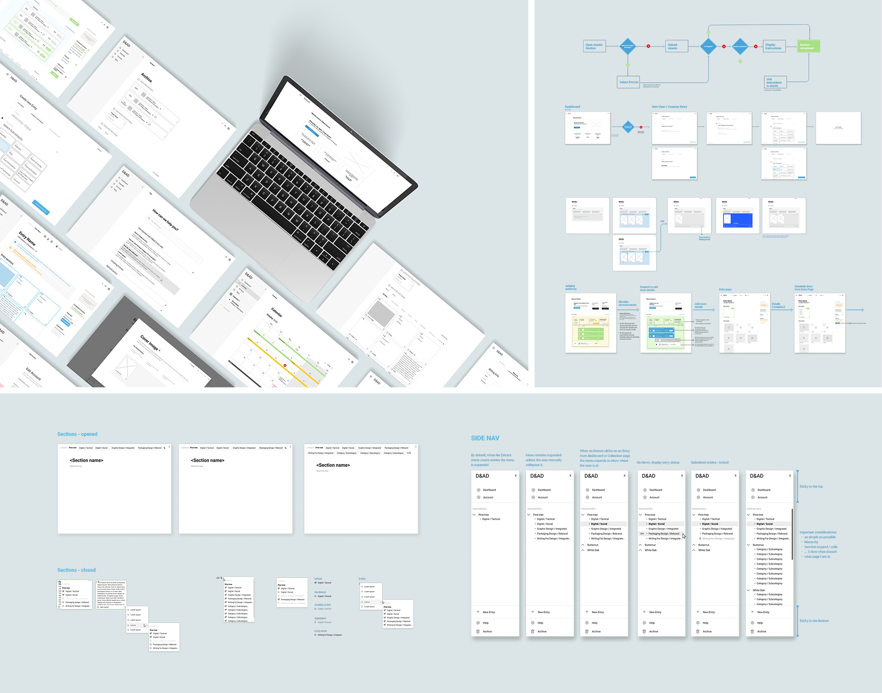
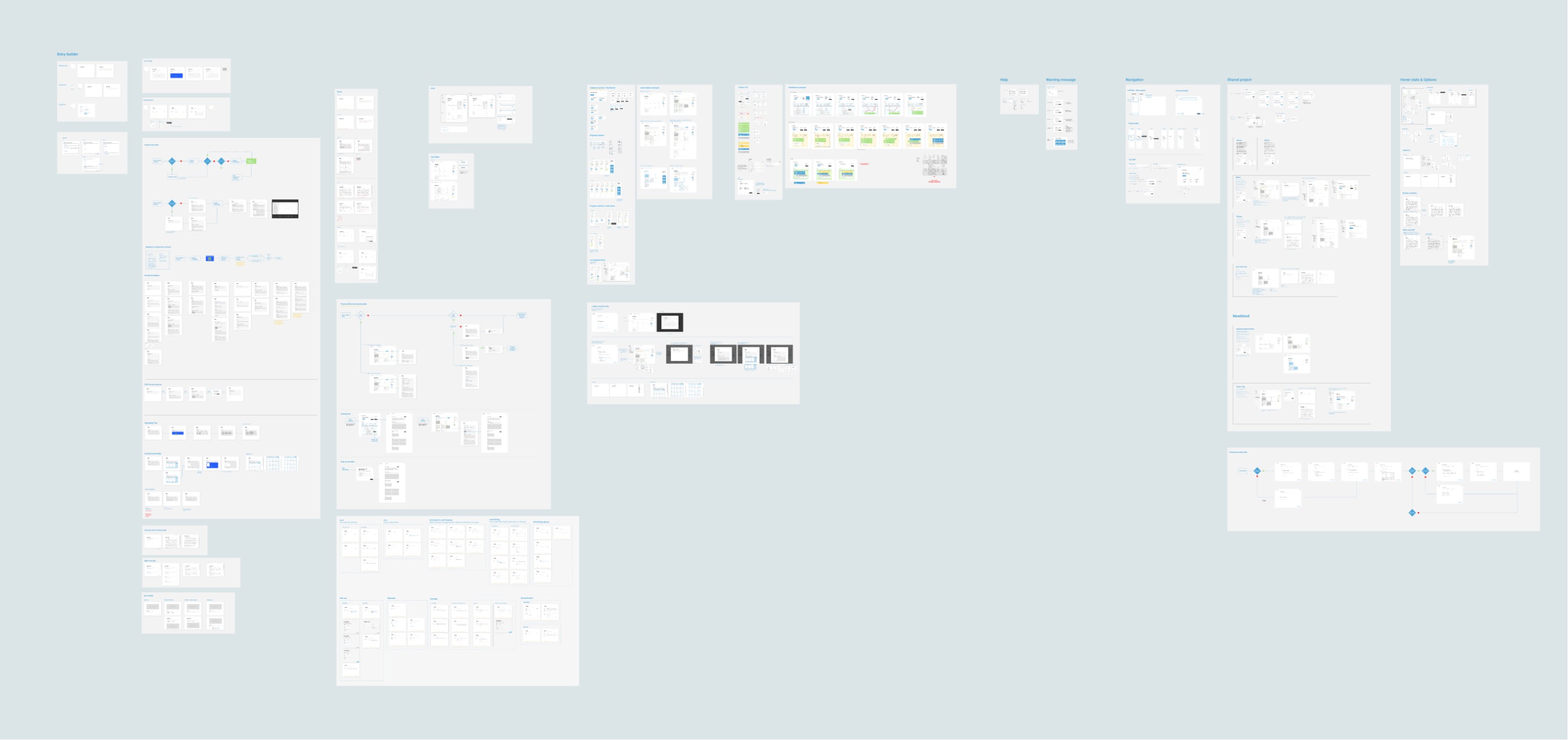
Wireframing & prototyping, refining layouts and user flows based on feedback.
Usability testing, validating improvements with real users to ensure clarity and efficiency.
Iterative design improvements, adjusting functionality and interactions to streamline the experience.
With a solid framework in place, I moved into Phase 3: Ideate & Design, where I translated research and strategy into interactive, user-tested prototypes.
Key activities included:
Wireframing & prototyping, refining layouts and user flows based on feedback.
Usability testing, validating improvements with real users to ensure clarity and efficiency.
Iterative design improvements, adjusting functionality and interactions to streamline the experience.
A major focus of this phase was ensuring feasibility. As the development team began building the core functionality, I worked closely with them to:
Validate technical constraints, ensuring that proposed solutions were achievable.
Align on UX best practices, maintaining consistency across the platform.
Refine complex workflows, such as bulk submissions for agencies and category-specific requirements.
By continuously iterating on user feedback and collaborating with developers, I ensured that the platform’s UX strategy translated smoothly into implementation.
By continuously iterating on user feedback and collaborating with developers, I ensured that the platform’s UX strategy translated smoothly into implementation.

PHASE 4: Design & Development
Once the core experience was finalized, the project moved into Phase 4: Visual Design and Development.
In this stage:
A UI designer refined the interface to enhance clarity and aesthetics.
An illustrator contributed visuals to strengthen the platform’s identity.
The development team implemented the final designs, ensuring the system worked seamlessly across different user scenarios.
Throughout this process, I continued to:
Collaborate with developers, addressing any UX challenges that arose during implementation.
Ensure alignment with user needs, making final refinements to key workflows.
Test and validate the platform, running final usability checks before launch.

Key Improvements & Impact
Through continuous iteration and user-driven enhancements, the D&AD Pro Awards Entry Site has evolved into a more intuitive, efficient, and flexible platform. Some of the most impactful improvements include:
Streamlined Entry Management for Large Agencies – Big entrants can now link entries and share content across multiple submissions. Entries are organized into projects, allowing users to enter a project into multiple categories seamlessly.
Faster & More Flexible Entry Creation – Selecting categories is now quicker and easier, with a more streamlined submission process. A bulk entry functionality allows entrants to create multiple entries for a project in just a few steps.
More Intuitive Submission Flow – The entry form is now friendlier and more flexible, allowing users to jump between different sections (cards) and fill in information as needed, making the process smoother and more efficient.
Enhanced Asset Management – A project gallery was introduced to help users easily upload and manage assets for their entries, reducing confusion and making the process more organized.
Simplified Credit Submission – Entrants can now reuse previously entered credits, eliminating the need to manually fill out the same information for each entry. This significantly reduces effort and speeds up the submission process.


FUTURE ITERATIONS
The D&AD Pro Awards Entry Site is continuously evolving through ongoing research and iterative improvements. To ensure the platform remains efficient and user-friendly, I regularly conduct:
Usability testing to validate new features and refine existing workflows.
Hotjar analysis to track user behavior, identify friction points, and uncover areas for optimization.
Annual user surveys to gather direct feedback on pain points and potential enhancements.
User interviews to gain deeper insights into evolving needs and challenges.
By continuously analyzing user interactions and gathering qualitative feedback, I implement incremental UX enhancements—refining workflows, information architecture, and submission processes to improve efficiency year after year.

The Team
Donal Keenan - Awards Director
Louise Wookey - Digital Project Manager
Dion Joy - Digital Director
Pippa Irvine - Digital Director
Bonita Bryan - Operations Manager
Nathan Walsh - Backend Developer
Sel-Vin Kuik - Frontend Developer
Carla Serra - UX Designer
Lauren Morsley - Illustrator
Wiedemann Lampe - UI Design
The D&AD Pro Awards Entry Site is continuously evolving through ongoing research and iterative improvements. To ensure the platform remains efficient and user-friendly, I regularly conduct:
Usability testing to validate new features and refine existing workflows.
Hotjar analysis to track user behavior, identify friction points, and uncover areas for optimization.
Annual user surveys to gather direct feedback on pain points and potential enhancements.
User interviews to gain deeper insights into evolving needs and challenges.
By continuously analyzing user interactions and gathering qualitative feedback, I implement incremental UX enhancements—refining workflows, information architecture, and submission processes to improve efficiency year after year
The D&AD Pro Awards Entry Site is continuously evolving through ongoing research and iterative improvements. To ensure the platform remains efficient and user-friendly, I regularly conduct:
Usability testing to validate new features and refine existing workflows.
Hotjar analysis to track user behavior, identify friction points, and uncover areas for optimization.
Annual user surveys to gather direct feedback on pain points and potential enhancements.
User interviews to gain deeper insights into evolving needs and challenges.
By continuously analyzing user interactions and gathering qualitative feedback, I implement incremental UX enhancements—refining workflows, information architecture, and submission processes to improve efficiency year after year.
The Team
Donal Keenan - Awards Director
Louise Wookey - Digital Project Manager
Dion Joy - Digital Director
Pippa Irvine - Digital Director
Bonita Bryan - Operations Manager
Nathan Walsh - Backend Developer
Sel-Vin Kuik - Frontend Developer
Carla Serra - UX Designer
Lauren Morsley - Illustrator
Wiedemann Lampe - UI Design